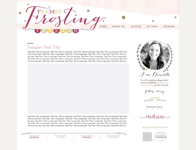
I recently had the opportunity to work with Danielle over at Framed Frosting on her blog design/rebrand, and today I'm going to give you a little sneak peek at how I created it from sketchpad to computer!
When Danielle first came to me, she had a lot of ideas on what she wanted it to look like. Whimsical, watercolor, polka dots, use of glittery gold, were a few things she had mentioned she liked.
So I set off to find a way to bring all these different elements together into one unified design. Like most of my designs, I began sketching on paper. With design so much geared toward computers these days, it's important for me to take a step back and conceptualize before jumping into a design. Sketching can not only lead to other great ideas, but it can also be the first step to creating organic & natural typography and graphics. Many sheets of paper later, I had a few "winning" sketches that I wanted to work with. I scanned them into the computer, where I vectorized them, and worked with them from there.
After laying down the "mood" of the design with the hand drawn elements, I then set off to incorporate watercolor into the design. I was unhappy with the watercolor images I was finding online, and knew that the only way to achieve the form, color, and quality I wanted was to produce it myself. So I whipped out my sophomore year watercolor set and began painting. I set off to achieve a shape that would fit well as a header and frame the top of the blog.
After producing the main graphic elements, the next step was to move to the computer. At this point, I sat down and figured out what types of fonts & colors would work well with the whimsical & organic feel I was trying to achieve. A mix of whimsical script & both clean cut serif and sans serif fonts turned out to be a great mix for a fun, young, and organic feel. Danielle had a certain color palette in mind, and after incorporating it throughout the design, everything came together! I loved working with Danielle to make her vision come to life and am so happy with how it turned out!
And that's how it all came to be! Like these behind-the-scenes types of posts
Let me know in the comments!
Looking for a custom blog design? Head on over to the studio website for package & pricing information! I'd love to take your brand to the next level!


Love this! So pretty!!!
ReplyDeletehttp://sequinsandpolkadots.blogspot.com/
Love it! What's that third font? swoon..
ReplyDeleteThanks, Kylie! It's called Bombshell!
DeleteLove it!! Very nice. I love getting a behind the scenes look into the designs!
ReplyDelete